For a young sports fan choosing their lifelong team on a whim, first impressions are everything. If the team is not chosen by location or because of others then it is almost certainly due to the uniforms. These outfits are how the teams choose to brand and present themselves, and are consistently changed to keep up with the times. With all that said here is every uniform set for the 2024 season ranked.
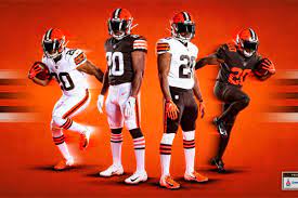
32. Browns
The only thing worse than Cleveland’s quarterback situation is their God-awful branding, and their uniforms are no exception. The brown and orange color scheme looks terrible, and without the colors the design itself is non-existent. There is not much variety with the different uniforms, however, the white alts do provide an okay alternative.
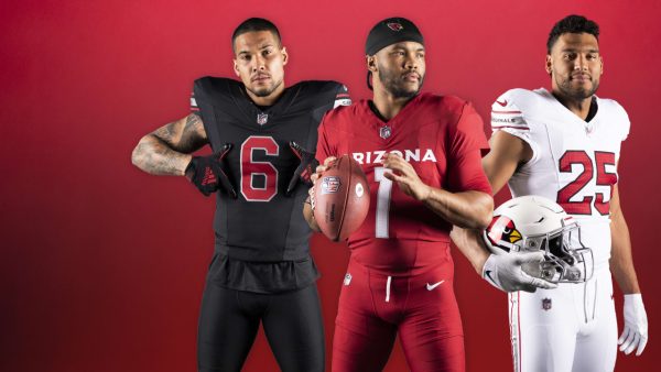
31. Cardinals
Generic with a capital ‘G’. No risks taken, nothing gained, and absolutely nothing worth talking about with these uniforms. They have the bare minimum variation with white, black, and red, and none of them do anything interesting.
30. Chiefs
All hate aside, these are very basic uniforms with no real variety to them. Red and white with yellow highlights. If you want more design, wait until they inevitably get their patches in February.

29. Bears
Again orange is not the move. The All Orange alts are hard to look at, but the other uniforms are fine. The stripes are a solid addiction and the blue color is a decent more tame tone to highlight the orange. On the boring side overall, but leagues above the bottom 2.

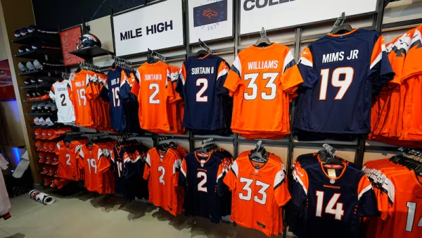
28. Broncos
What is it with orange teams and horrific quarterback situations? Regardless, these uniforms feel like a better version of the Bears. Similar colors, and similar ideas, but better execution. More personality in the design and good throwbacks give the Broncos an edge.
27. Jets
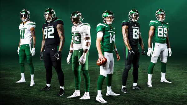
The Jets uniforms are about as impactful as Aaron Rodgers’ passing yards last year. That is to say that they aren’t. The green and white look nice, and the blacks are solid alternatives. The only notable feature is the shoulder ‘spikes’ which are okay.
26. Commanders
The newest team in the NFL (name-wise) has solid home gear. The maroon with yellow looks solid on their jerseys and the helmets are on point. Unfortunately, the aways are lacking with nothing except their weird bad gradient numbering, and the alts are Steelers-themed. I commend them for taking an interesting unique risk on the alts, but it just doesn’t feel like Washington.

25. Giants
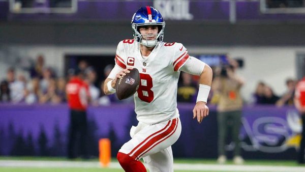
The first American-themed color scheme on this list comes in with okay results. Pretty basic overall, but it looks nice and cohesive. The alts are just simple throwbacks, and the design doesn’t take any big risks. It’s not the best and doesn’t try to be, but it does its job well.
24. Cowboys
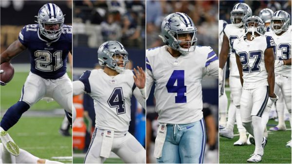
Legacy can only take you so far. The home uniforms are mostly standard and the alts are just throwbacks, however, the away uniforms are great. The blue takes a more lively approach here and the pants even get to take a more aquatic tone. Other than the away uniforms the rest are characterized by that same bland blue that the Bears and Broncos use.
23. Packers
The best sports team in Green Bay is well known for sporting their Dark Green and Yellow. That’s it, points for a unique color scheme and yellow pants, but other than that it doesn’t do anything crazy. The yellow helmet helps to keep the ‘cheesehead’ identity going which is cool, but not top 20 cool.

22. Dolphins
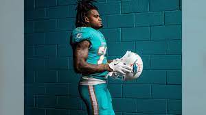
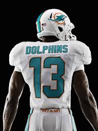
Teal and Orange are incredible colors. Even though nothing is going on design-wise, the colors pop and set them apart from every other sports team. Good, but plain.
21. Saints
Another unique color scheme with gold, black, and white. They are iconic, cool, simple, and get the job done. All that’s left is for the Saints to follow suit.

20. Seahawks
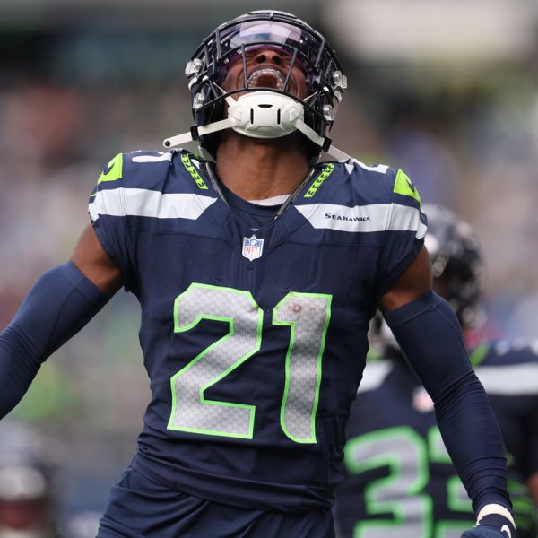
The Seahawks have outstanding uniforms the majority of the time. The colors are just bold enough, the neon highlights are used just the right amount, and the uniform has just enough going on without becoming too busy. Even their throwbacks look awesome and pop. It’s a shame their neon alts are painful to observe. The neons are the worst uniform on this list by far and single-handedly weigh down the ‘hawks. Thank God they are only alts. 
19. Bengals
These may be the best-themed uniforms on this list. The tiger pattern on the helmet, pants, and jersey makes them stand out and puts their orange rivals to shame. The alts go even further with a white tiger theme and are some of the best conceptual jerseys in the league when paired with the white helmet. However orange is just a hard color to work with and all oranges are rough. Beyond this, they may be a bit overdesigned, especially with the pants.

18. Raiders
This is basic but good. The silver, white, and black scheme fits the vibe of Las Vegas well. The general shine of the uniforms and helmet’s silver with the surrounding darkness is thematically perfect for the city of sin. Overall, clean, but basic. 

17. Colts
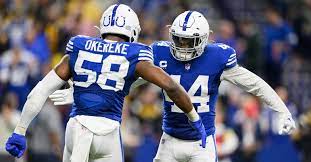
Blue, white, and 2 diagonal shoulder stripes. It’s classic and minimalist, but well-known and loved. Up until recently, this was it, but the more recent addition of the Indiana Nights uniform boosts this placement. It’s a clean darker more energetic blue with a phenomenal-looking black helmet. While it has its haters it is a great addition at least for the sake of variety.
16. Lions
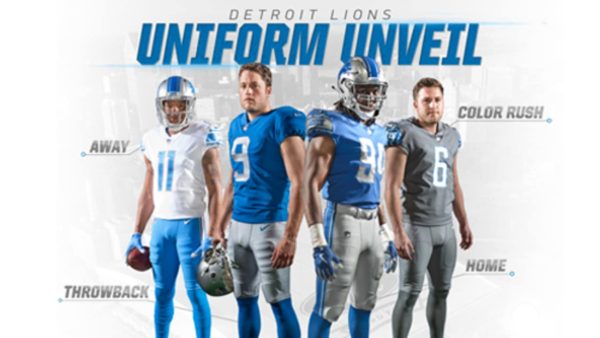
As if to celebrate the best season the Lions have had in the Super Bowl era, new uniforms dropped in Detroit this offseason. The design itself isn’t anything special, but the colors are next level. The Honolulu blue and silver look outstanding, and the choice to add a colored facemask brings it together. Not to mention the new black alts with an awe-inspiring blue helmet and a black logo.
15. Titans
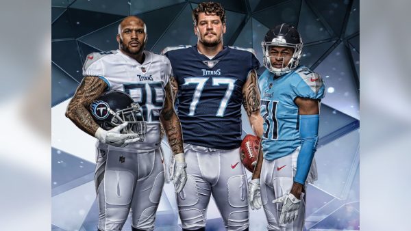
The default Titans uniforms may be the most average thing ever witnessed by man. However, the Oilers uniforms are near perfection. Great throwbacks are made even better by the fact that they are essentially just a different team altogether. The designs are unique and the bright sky blue and sharp red highlights look outstanding. Not to mention the incredible narratives it creates when they go against the Texans. 
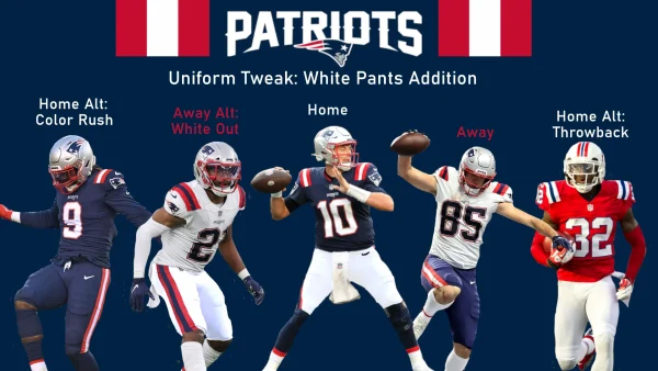
14. Patriots
Clean uniforms all around. Not much to say, just the right amount of design, and good color choice that makes it feel perfectly patriotic. The throwbacks are also great and give solid variety with the eye-catching red and the return of Pat Patriot.
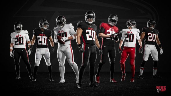
13. Falcons
This is what the uniforms would look like if the Cardinals tried harder. The standards are mostly black or white with supporting red highlights, which is clean if not a little bland. As far as alts go, the red helmet is cool, the throwbacks are essentially the same, and the gradient was certainly an interesting risk.
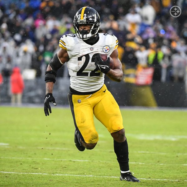
12. Steelers
Black and yellow is an iconic color combo that looks great on everything, and these uniforms are no exception. Yellow is not heavily used by many teams, and when looking at these uniforms it’s hard to see why. They successfully managed to corner the yellow market and do it in a good-looking way, however, their lack of variety stops them from advancing. 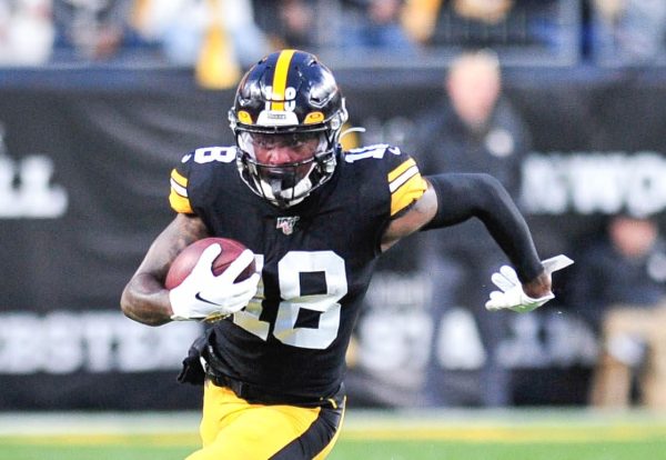
11. 49ers
While the red looks great, the gold is what brings it all together. The jerseys look simple and good with their current designs, the gold pants are solid, but the metallic golden helmet is what puts them so high. It’s a perfect highlight and centerpiece of these outfits and fits well with all of the uniforms. The throwbacks are nice but nothing crazy. 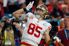

10. Jaguars
Despite being the second teal team on this list their colors are much less abrasive than Miami’s. Solid simple design work around the shoulders. Played it a bit safe with the different uniform designs and colors but they all look good.

9. Bills
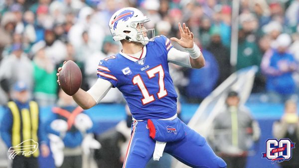
This is how you do red, white, and blue. Each of their primary colors gets their own uniform while always incorporating all 3 and they all look great. The rest of the design gets the job done, although there has been some past discourse over their players fitting into their gloves, so functional improvements may be needed. 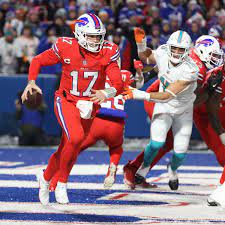
8. Texans
After performing the best rebuild of all time they commemorated it with new uniforms and helmets. The uniforms are already a clean navy blue with red and clean crescents around the shoulders. The new helmets look great with a nice battle red with the horns, and a blue H-town design for variety.

7. Buccaneers
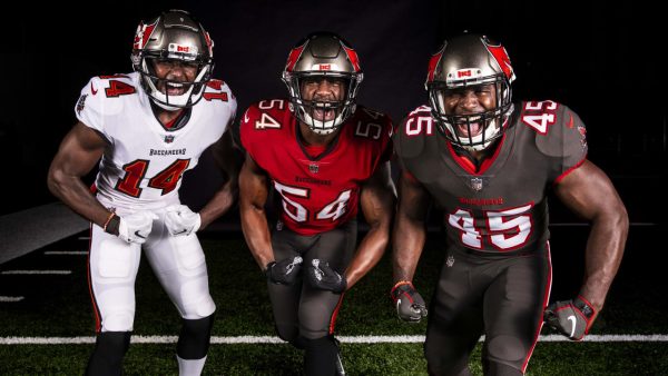
The standard uniforms are great with the maroon and gray. However the throwback ‘Creamsicles’ are some of the best in the league. Great reference to the past, and a great retro feel with the color scheme.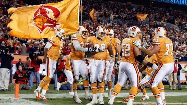
6. Eagles
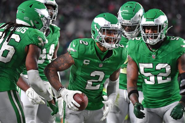
The midnight green looks solid on its own, but the wings on the helmet in place of a logo are outstanding. Beyond this, the beloved Kelly Green alts are fan favorites for a clear reason.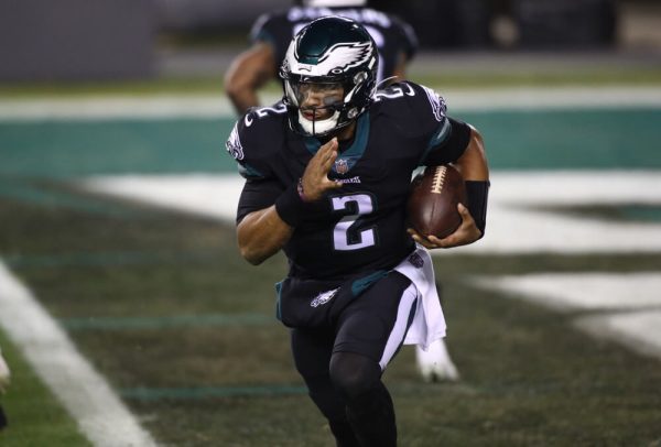
5. Vikings
Purple is just an amazing color in general, and the yellow highlights heighten it even further. Beyond this the horns on the helmet in place of the logo are outstanding and the throwbacks offer a decent darker color scheme.

4. Panthers
These two-win-wonders come in with some incredible uniforms. The home black with Process blue and some silver are the best black jerseys in the league. Beyond this, the whites are standard with great colors and the alternate blues with silver are great. The decision to use black as a color and blue as an alt works amazingly here as the black looks cool and sleek while the blue is energetic and fun.

3. Rams
Coming into the top 3 is the LA Rams. These uniforms are simple, clean, and just the right mix of past and present. The colors of royal blue and yellow are nothing special but the design itself is excellent. The helmets and shoulders feature the iconic horns used since the team’s inception but with more vibrant colors. The numbers on their jerseys are also well known for using the best gradient in the league, which isn’t saying much, to add some depth. No notable alts.

2. Ravens
The royal feel of the purple and gold cannot be matched. It gives off the vibe of pure dominance and power. Whether in their home purples, their away whites, or the raw black and purple alts they look tough. Not super energetic or fun, but these uniforms are by far the most intimidating in the league. Perfectly iconic.

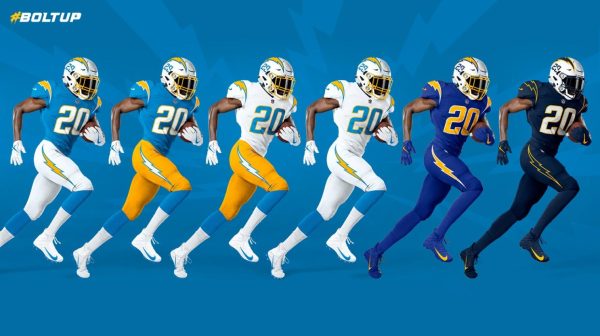
1. Chargers
LA finishes off the list with the Chargers with the iconic powder blue and yellow. These colors perfectly match the energy of lighting and are highlighted by the tasteful bolts on the outfits and helmets. If the powder blue isn’t enough there are also royal blue and navy blue alternates, the latter of which has hollow bolts to add variety. Anyway you slice it this team has incredible uniforms and plenty of them.
